 Sale!
Membership
Sale!
Membership
Prompt Builder
Original price was: $20.99.$2.09Current price is: $2.09.
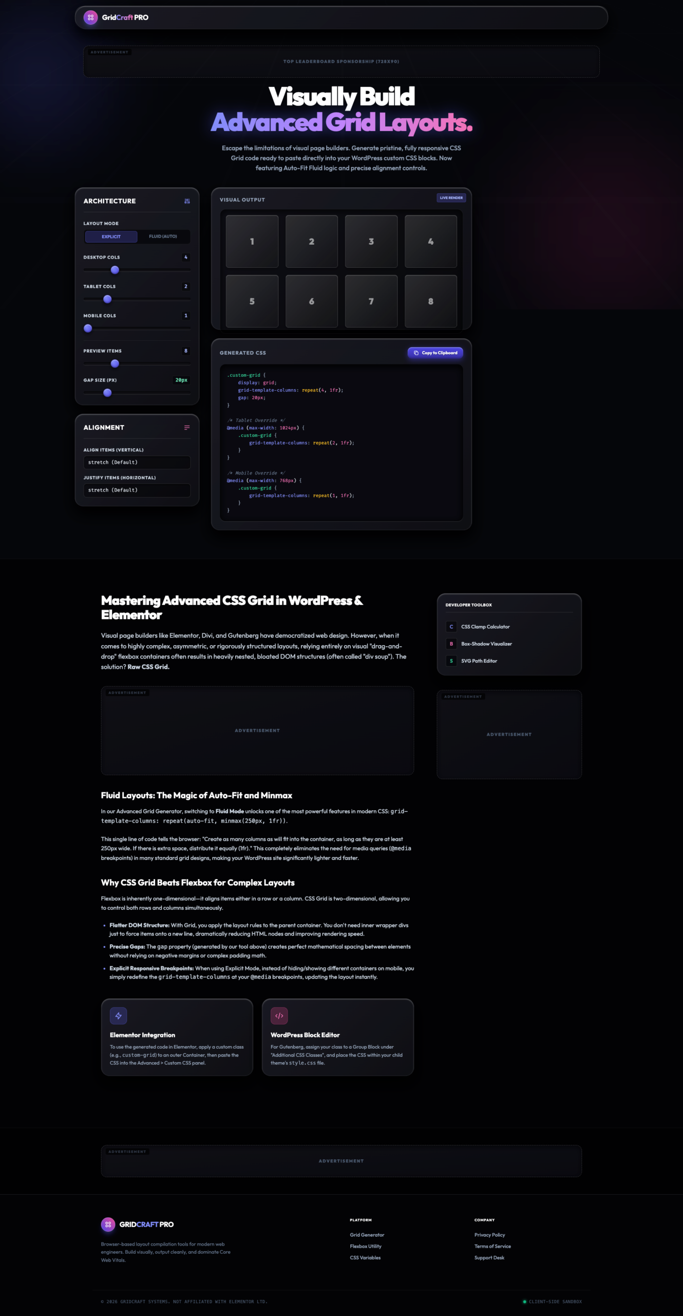
Build responsive and professional CSS Grid layouts for WordPress, Elementor, Gutenberg, and custom websites with WordPress CSS Grid Layout Generator – Resell Rights. Generate responsive CSS Grid code visually, customize columns, gaps, alignment, breakpoints, fluid layouts, and instantly copy production-ready CSS. Perfect for developers, designers, agencies, Elementor users, and WordPress professionals.
WordPress CSS Grid Layout Generator – Resell Rights is an advanced visual CSS Grid builder that helps WordPress users create professional responsive layouts without manually writing complex CSS code.
Modern WordPress websites require flexible and responsive layouts that work seamlessly across desktops, tablets, and mobile devices. While page builders provide basic layout controls, advanced grid structures often require custom CSS knowledge. This tool eliminates that complexity by providing a visual interface for generating production-ready CSS Grid layouts instantly.
Using the intuitive drag-and-configure interface, users can customize desktop columns, tablet layouts, mobile breakpoints, fluid grids, alignment controls, spacing, and responsive behavior while previewing layouts in real time. The software automatically generates clean CSS code that can be directly used in WordPress themes, Elementor custom CSS, Gutenberg blocks, WooCommerce layouts, and custom web projects.
The tool supports both traditional responsive grids and advanced Auto-Fit Fluid Layouts using CSS Grid’s powerful repeat(), auto-fit, and minmax() functions. Whether you’re building portfolios, landing pages, product grids, blog layouts, service sections, or custom WordPress designs, this generator significantly speeds up development while ensuring professional results.
✅ Visual CSS Grid Builder
✅ Responsive Grid Generator
✅ Elementor Compatible
✅ Gutenberg Compatible
✅ Fluid Layout Support
✅ Auto-Fit Grid System
✅ Live Layout Preview
✅ Custom Breakpoints
✅ Alignment Controls
✅ Production-Ready CSS Output
Design complex CSS Grid layouts visually without coding.
Customize separate layouts for desktop, tablet, and mobile devices.
Generate modern responsive grids using auto-fit and minmax() functions.
Instantly visualize layout changes before generating CSS code.
Control desktop, tablet, and mobile column counts.
Configure:
Generate responsive media queries automatically.
Copy clean CSS Grid code instantly.
Customize spacing between grid elements.
Works perfectly with Elementor, Gutenberg, WooCommerce, and custom themes.
Sale!
Membership
 Sale!
Membership
Sale!
Membership
 GeneratePress Template
 Sale!
Membership
Sale!
Membership
Reviews
There are no reviews yet.