 Sale!
Membership
Sale!
Membership
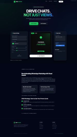
WhatsApp Promo Card Generator Tool
Original price was: $241.49.$24.14Current price is: $24.14.
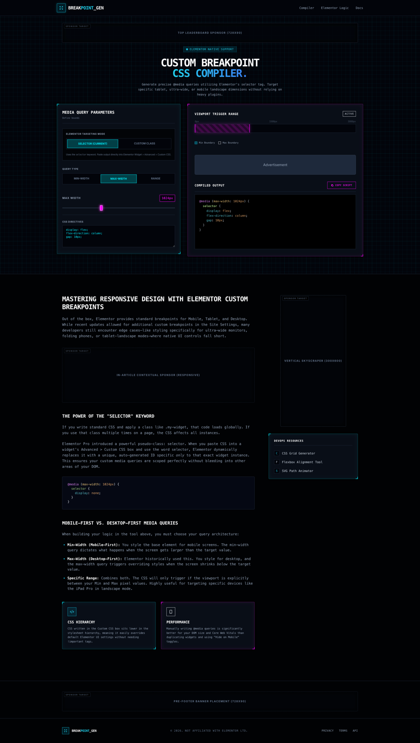
Generate custom Elementor CSS breakpoints instantly with Elementor Breakpoint Generator – Resell Rights. Create responsive media queries, custom viewport ranges, mobile-first and desktop-first CSS rules, Elementor selector-based styling, custom class targeting, responsive layouts, and device-specific design adjustments without writing complex code manually. Perfect for Elementor designers, WordPress developers, agencies, freelancers, and web professionals.
Elementor Breakpoint Generator – Resell Rights is a professional responsive design utility built specifically for Elementor users who need complete control over custom screen sizes, viewport breakpoints, and responsive CSS behavior.
While Elementor provides standard mobile, tablet, and desktop breakpoints, many websites require more advanced targeting for ultra-wide monitors, custom tablets, landscape devices, foldable screens, large desktops, and specific viewport ranges. This tool eliminates manual CSS complexity by visually generating accurate media queries with Elementor-compatible selectors.
The software includes a visual breakpoint generator, media query builder, custom viewport controls, Elementor selector integration, responsive CSS compiler, live viewport visualizer, min-width and max-width targeting, range-based media queries, custom CSS rule generation, and one-click copy functionality.
Whether you’re building landing pages, ecommerce stores, agency websites, client projects, SaaS dashboards, membership sites, or custom WordPress solutions, Elementor Breakpoint Generator helps create pixel-perfect responsive designs quickly and efficiently.
✅ Generate responsive CSS instantly
✅ Elementor selector support
✅ Create custom breakpoints
✅ Mobile-first design support
✅ Desktop-first design support
✅ Custom viewport targeting
✅ No coding expertise required
✅ Improve responsive layouts
✅ Faster Elementor workflow
✅ Save development time
Generate precise media queries for any screen size or viewport width.
Uses Elementor’s selector targeting system for widget-specific responsive styling.
Create mobile-first responsive CSS rules effortlessly.
Generate desktop-first responsive layouts quickly.
Target specific screen width ranges using combined media queries.
Visualize responsive breakpoints and viewport trigger zones in real time.
Generate CSS for Elementor widgets or custom website classes.
Automatically creates clean production-ready CSS output.
Copy generated media queries instantly.
Optimize layouts for tablets, mobiles, desktops, and custom screen sizes.
Instantly see generated CSS as settings change.
Works smoothly on desktop, tablet, and mobile devices.
Sale!
Membership
 Sale!
Membership
Sale!
Membership
 Sale!
NB Lifetime Member
Sale!
NB Lifetime Member
 Sale!
NB Lifetime Member
Sale!
NB Lifetime Member
Reviews
There are no reviews yet.